 Last modified:
Wednesday, 06-May-2020 17:54:40 UTC. Authored by: Fiona Carter (frabbitry at gmail.com) Edited and maintained by: Elisa E. Beshero-Bondar
(ebbondar at gmail.com). Powered by firebellies. Last modified:
Wednesday, 06-May-2020 17:54:40 UTC. Authored by: Fiona Carter (frabbitry at gmail.com) Edited and maintained by: Elisa E. Beshero-Bondar
(ebbondar at gmail.com). Powered by firebellies.
Last modified:
Wednesday, 06-May-2020 17:54:40 UTC. Authored by: Fiona Carter (frabbitry at gmail.com) Edited and maintained by: Elisa E. Beshero-Bondar
(ebbondar at gmail.com). Powered by firebellies. Last modified:
Wednesday, 06-May-2020 17:54:40 UTC. Authored by: Fiona Carter (frabbitry at gmail.com) Edited and maintained by: Elisa E. Beshero-Bondar
(ebbondar at gmail.com). Powered by firebellies.Maps, at their most basic, are symbolic, visual representations of elements arranged in a space. From the ancient maps, originating in Mesopotamia, of the night sky to modern maps of Subway system, maps have been guiding people and graphically depicting spatial relationships for centuries. Geographic information systems, or GIS, are computer systems intended to capture, store, check, and display geographic data, or data related to positions on Earth’s surface (National Geographic). Some popular GIS systems include ArcGIS, QGIS, Google Earth Pro, and MapInfo. This tutorial focuses on QGIS.
From the QGIS website, “QGIS is a professional GIS application that is built on top of and proud to be itself Free and Open Source Software (FOSS)… It runs on Linux, Unix, Mac OS X, Windows, and Android and supports numerous vector, raster, and database formats and functionalities.” It is an official project of the Open Source Geospatial Foundation, or OSGeo, whose “mission is to foster global adoption of open geospatial technology by being an inclusive software foundation devoted to an open philosophy and participatory community driven development (OSGeo). As part of this movement and as stated above, QGIS is open-source software, which means that its source code is publicly available to be modified and contributed to; this means that it by principle is free to use.
To download QGIS, go to Download QGIS and select the installer appropriate for your operating system, such as Windows, Mac OS X, or Linux Ubuntu. Please take care to download version 3.4.15 - Madeira or a newer version. This tutorial was created with 3.4.15 in mind, and so later versions might look slightly different, though the functionality will still be the same. Earlier versions, such as 2.18, will look very different, and if you install a version earlier than 3.0 you might have serious difficulty following along with the tutorial. Let me know if downloading an earlier version of QGIS (earlier than 3.0) is necessary for you.
In QGIS, we work in Projects. To create a new project, first open QGIS. One option would be to click the icon of a piece of white paper in the upper left-hand corner of the page. It is circled in red in the image below.

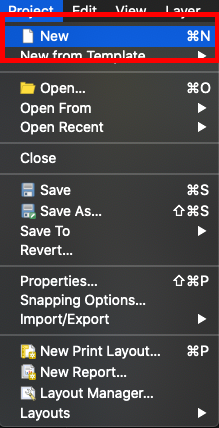
Alternatively, you could hit the “Project” button in the ribbon at the top of the page and then select “New Project” from the resulting dropdown menu. It is circled in red in the image below.
Another option, evident with the image of the menu above, is to use the shortcut Command-N (for Mac OS X users) or Control-N (for Windows or Linux users).
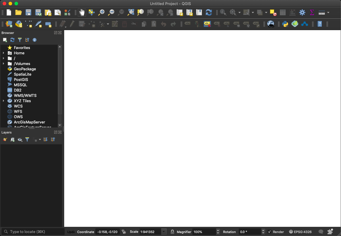
Once you have created a new project, your QGIS screen should be blank, like the following image.
QGIS, like all GIS, “analyzes spatial location and organizations layers of information into visualizations using maps and 3D scenes. With this unique capability, [it] reveals deeper insights into data, such as patterns, relationships, and situations” (ESRI). It utilizes layers to allow users to dive deep into a location and glean more information from it than traditional maps may have allowed. Layers are added to a project to create a map.
Next, you’ll add your first layer to the QGIS project, the base layer: the OpenStreetMaps XYZ Tiles. An XYZ Tile Layer is “a set of web-accessible tiles that reside on a server. The tiles are accessed by a direct URL request from the web browser” (Tile layers—Portal for ArcGIS (10.3 and 10.3.1) | ArcGIS Enterprise). As such, you’ll need an Internet connection to first add this layer to your project; however, it’s essentially a base map of the world that OpenStreetMaps, another open-source project, provides for free from their server.
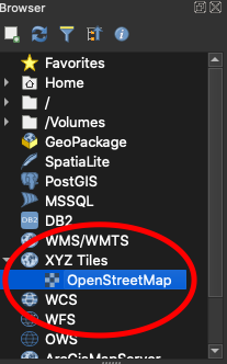
To add the OpenStreetMap XYZ Tile Layer to your project, go to the Browser menu on the left-hand side of the page and select “XYZ Tiles.” The option “OpenStreetMap” should appear below “XYZ Tiles,” as pictured below.
Double click on “OpenStreetMap” to add the layer to your project. Your QGIS page should now look like the image below, with a map of the world where the blank white space used to be.
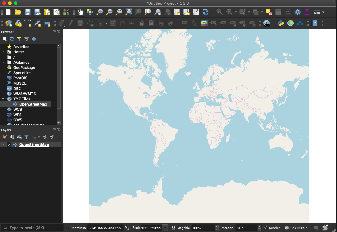
You should notice that now “OpenStreetMap” is present in the “Layers” menu, which is beneath the “Browser” menu. One other thing to notice is that there is a checkmark next to the layer name, which means that that layer should be visible on the map. To deactivate that layer, click on the checkbox to remove the checkmark; you should then see the map of the world disappear from view.
Next, we will import a TSV (tab-separated values) file and use it to generate another layer, which we will place on top of our base map.
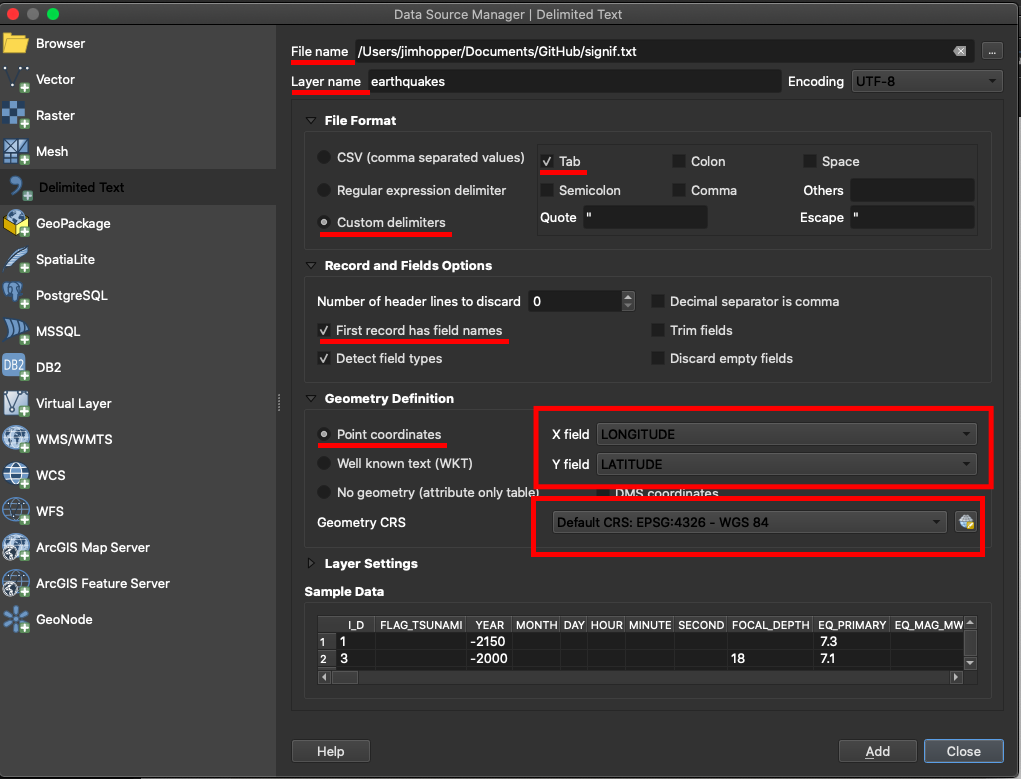
Please download the following text file, which is a TSV file with the latitude and longitude coordinates of all significant earthquakes since 2150 BC from NOAA’s National Geophysical Data Center. Save this to your computer as a .txt file, a .csv file, or a .tsv file. This data in this file is separated by tabs, which makes it technically a tab-separated value (TSV) file. Any file that contains data separated by a specific character is a delimited text file, so as long as you save it as one of those, you will be fine.
If you open this file and examine it, you’ll notice that there is a column for latitude coordinates and a column for longitude coordinates. Those are the two most essential columns in this document for creating a layer in QGIS: the X and Y coordinates of the locations you want to map.
Quite simply, the X coordinates will be the longitude coordinates and the Y coordinates will be the latitude coordinates. Why?
Remember the Cartesian coordinate plane.
 Picture source: calculus - Standard Cartesian Plane - Mathematics Stack
Exchange
Picture source: calculus - Standard Cartesian Plane - Mathematics Stack
Exchange
The y-axis goes up and down; it is vertical. Conversely, the x-axis goes from left to right; it is horizontal.
Now, remember latitude and longitude lines.
 Picture source: What Is Longitude and Latitude?
Like the x-axis, lines of latitude go from left to right across the globe; they are horizontal. Similarly, the lines of longitude, like the y-axis, are vertical. As such, the X coordinates of the table are the latitude coordinates, and the Y coordinates of the table are longitude coordinates.
To import a document into QGIS, its data must be in some way connected to location. Perhaps the easiest connection to make is for each row in the table to have X and Y coordinates. Otherwise, you’ll have to join tables, which is something that we will get into later.
If you have project data that you would like to map, you can create your own CSV or TSV files to import as Delimited Text Layers. For a good introduction on how to generate a TSV from project data with XQuery or XSLT, please refer to Dr. B’s (XML to Cytoscape Tutorial) While that tutorial is focused on generating a TSV or CSV specifically for Cytoscape or network analysis, it is still useful for explaining the basic concepts of how to construct and output a text-delimited, such as TSV or CSV, file. You’ll want to do the same kind of thing to make a delimited text file for QGIS.
However, one thing to note is that unlike text-delimited files created for network analysis, text-delimited files created for QGIS do not need to use concepts like “edge” or “node.” Unlike network analysis, with QGIS you are not graphically representing relationships of association or connection in your data; you are representing spatial relationships of data that is somehow related to location or place.
As such, you really only need two columns in a text-delimited file to import it into QGIS as a delimited text layer: a column for latitude coordinates and a column for longitude coordinates. Other columns of course can be present and may be useful, but they would need to be tied to specific geodata, or latitude and longitude coordinates; for example, perhaps you have columns for latitude and longitude along with a column with the name of each place represented by the coordinates. As long as the information included in the other columns of the CSV or TSV are tied to the coordinates, you can have as many of them as you should so desire.
There is a very simple example below of a CSV that could be imported into QGIS.

As you can see, there are two rows and four columns for this CSV. This is viewed through GitHub’s file viewer, and so the actual commas that separate each of the values are hidden from view so that the table is more readable, but they are there nonetheless.
The first column is a unique ID attribute for each of the places; it is merely the number of the row. It’s very good practice to have a unique ID for every row of any table that you want to include in a database, such as QGIS. I will refrain from getting into the normalization process, but a file cannot be a table in a database until it has a unique identifier for every row. In practice, unique identifiers can be extremely useful because they are a means by which you can identify any specific row; furthermore, they do not necessarily have to be numeric. The only condition is that they are unique. In this case, it is perhaps a bit redundant to use the row number, because there are only two places. The latitude or longitude coordinates themselves could be unique identifiers. However, if I’d included a place in a table more than once, then that system would fail, and one always wants to imagine what could go wrong in the case that one might expand the table when one creates the table in the first place. In short, that’s what that column is and why it’s there.
The second column, “lat,” holds the latitude coordinates for each of the locations. Similarly, the third column “lon” contains the longitude coordinates.
Finally, the fourth column, “place_name”, contains the names of the locations described by the latitude and longitude coordinates in the second and third columns.
As implied by the section above, your project data will be suitable for QGIS mapping if it includes latitude and longitude coordinates. This of course implies that there is something in your project to do with actual, physical locations that could be mapped.
(Note: If, perhaps, your project works with fictional locations, then another option that you might want to consider is image mapping. In this case, you take a picture of a fictional map, then perhaps convert it to an SVG with some tools that Dr. B can tell you about, and then use image mapping, also something Dr. B can tell you more about, to draw shapes on the picture of the map, so that you can add layers and add meaning to the map that way.)
If your project has something to do with real locations, but you do not have latitude and longitude coordinates in your XML, then you will need to put latitude and longitude coordinates in your XML so that you can then extract such data using XSLT or XQuery.
Perhaps the simplest way to go about putting latitude and longitude coordinates into your XML is to go manually look them up and manually type them into attribute values or an element or so on.
Good places to manually find latitude and longitude coordinates using place names or other reference data are OpenStreetMap and Google Maps. With both of these places, you can just search for your location in the search bar.
In Google Maps, you will then be presented with a map with a pin on it representing your location. To find the latitude and longitude coordinates, right click on the pin, and then click “More Info about this Point.”
You’ll then be presented with a box like the one in the image below.
 (Yes, Pennsylvania is in French here,
but this is the geodata associated with 150 Finoli Drive, Greensburg, PA,
15601).
(Yes, Pennsylvania is in French here,
but this is the geodata associated with 150 Finoli Drive, Greensburg, PA,
15601).
The latitude coordinate is the one on the left, the first coordinate (here, 40.276473) and the longitude coordinate is the one on the right, or the second one (here, -79.531310).
In Open Street Maps, you’ll be presented with a page like the following (or you may be presented with a set of links for different locations if there was ambiguity in your location reference, so click on the correct link to be directed to a page like the following).
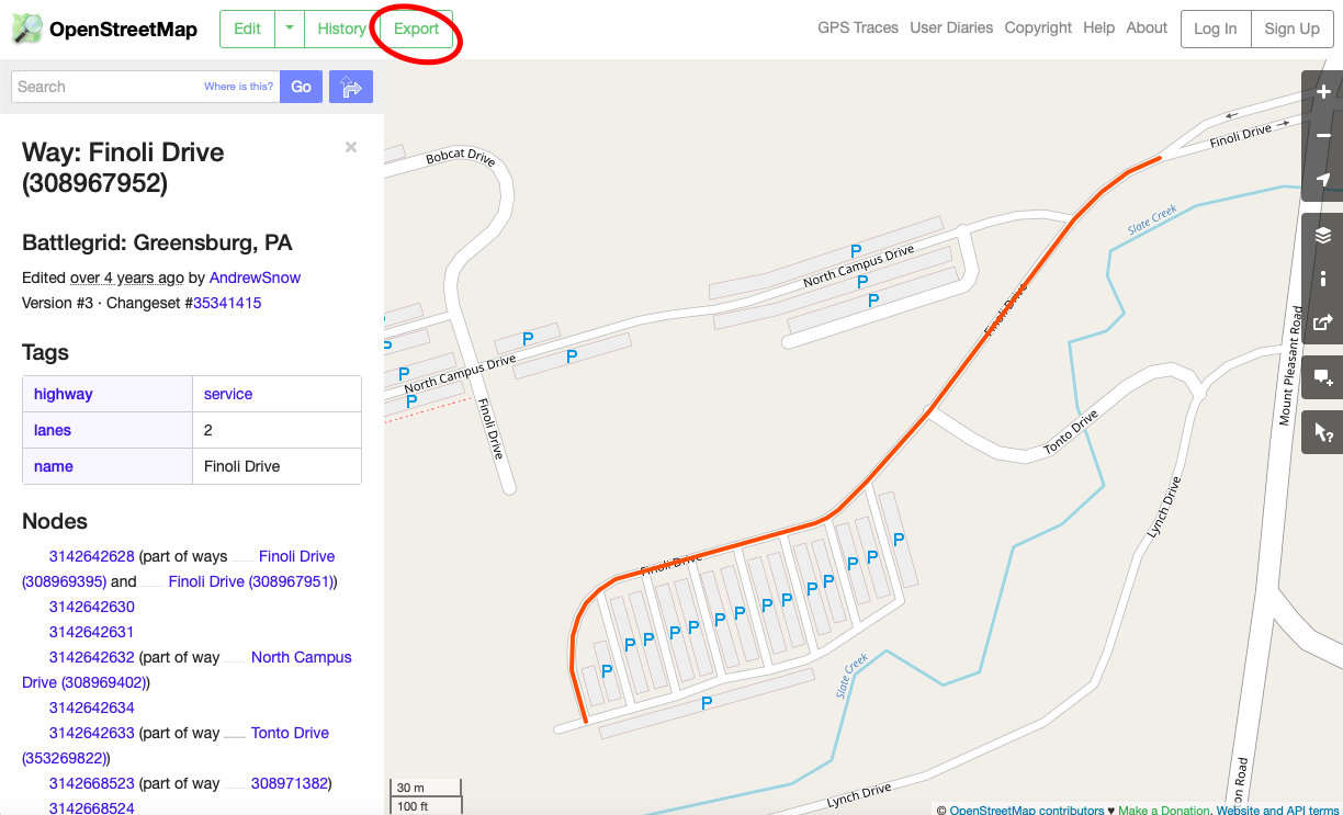
To get the latitude and longitude coordinates of this location, click on the “Export” button on the top left-hand side of the page, circled in red above.
You’ll then be presented with a set of coordinates representing a range, as pictured below.
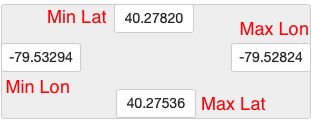
OpenStreetMap recognizes that there might be slight variation or error in any geocoordinates they provide you with (feel free to read up on the creation of geodata and satellite triangulation etc. for more on that), so it provides you with a range of values, representing both ends of the range where the location may be: the minimum and maximum values for the longitude and latitude coordinates. I’ve labelled each of the numeric values in the image above. You’ll have to decide whether you want to go with the maximum or minimum values—just be sure to be consistent; for example, don’t mix them up and take the max latitude coordinate of a location along with the minimum longitude coordinate.
With these, you can then copy and paste the coordinates into your XML.
Alternatively, if you click “Export” beneath the OpenStreetMap licensing information,
you can download a .osm file, which is in fact an XML file. You can then use XSLT
to
integrate the latitude and longitude coordinates held in that file into your XML
code. The latitude and longitude coordinates, again in a range, are held in the
boundselement of this .osm file, in the attributes
minlat, minlon, maxlat, and
maxlon. You can reference Dr. B’s tutorials and assignments on
XSLT, published at dh.newtfire.org, for more on how to do that.

Alternatively, if you need to grab latitude and longitude coordinates for a lot of locations, it may be easier to utilize an API. Reference Dr. B’s GitHub issue on using an API for more on that.
To import the data file, go to “Layer” in the top ribbon, hover over “Add Layer,” and then select “Add Delimited Text Layer.” If you remember from before, the file that we want to add is a delimited text file, and so the layer that we want to add is a delimited text layer.
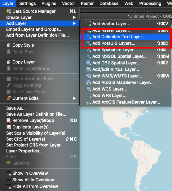
There are other types of layers, such as Vector layers or Raster layers, but we will worry about those later.
You will then be faced with a screen that looks like this one.
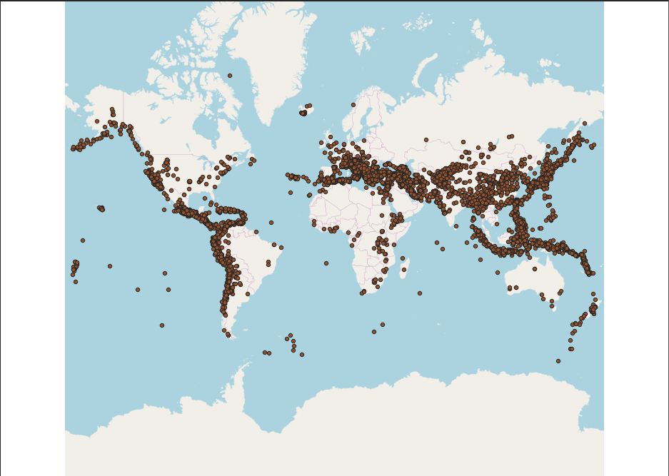
Pins, marking the locations of significant earthquakes around the world, should appear on your base map.
Your list of Layers should now look like the following image.
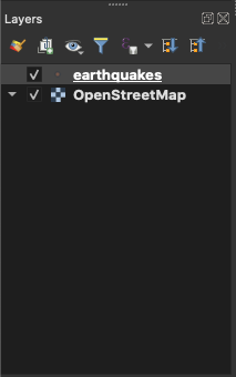
You should notice that the new layer, “earthquakes”, is higher on the list than “OpenStreetMap.” This means that the “earthquakes” layer is layered on top of the “OpenStreetMap” layer. If you were to click and drag the “earthquakes” layer, then it would disappear on the map, because the base map “OpenStreetMap” would then be layered on top of it; it would cover it and render it invisible.
Congratulations! You’ve added your first layer to your first project.
Now, we’ll work on creating a map from the project.
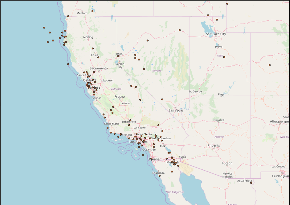
Use the Pan and Zoom controls in the QGIS menu bar, pictured below, to zoom in on California.

The resulting zoom should look something like the following image.
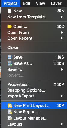
Next, click on “Project” in the top ribbon, and then click on “New Print Layout.”
You’ll then be asked to give the new Print Layout a name. (Yes, I misspelled California in the screenshot, but I don’t want to take another one.)
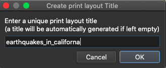
Give a name, and then click “OK.”
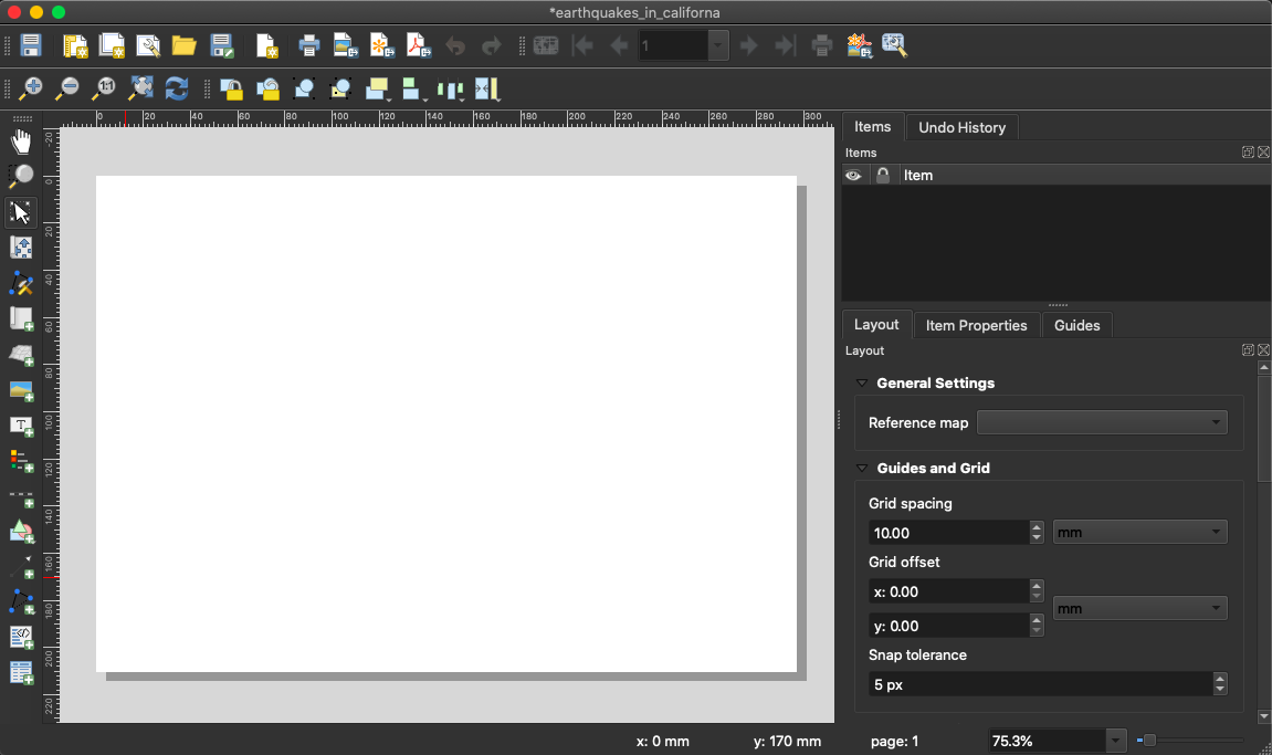
You should be then presented with a blank screen.
Click on “Zoom Full” (the magnifying glass with three arrows pointing outward) to get the full extent of the map layout.
Next, go to “Add Item” in the top ribbon and select “Add Map” from the dropdown menu.

Once you click “Add Map,” the “Add Map” mode will be activated. Click and drag a square on the white canvas to add a map to that square.
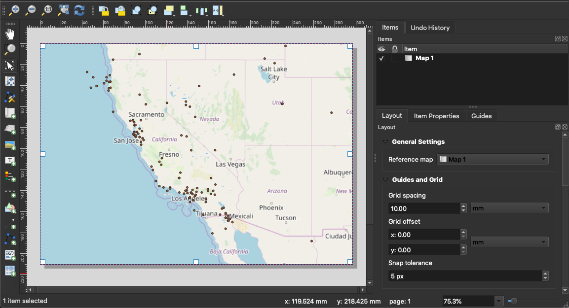
You should end up with an image like the one above.
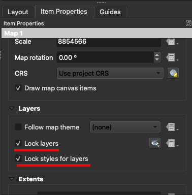
Next, click the “Item Properties” tab on the right-hand side of the page and make sure that the boxes next to “Lock layers” and “Lock styles for layers” are checked.
Then, navigate to the main QGIS window. Use the Pan and Zoom tools to zoom in on the San Francisco Bay Area. We will use this area as an inset on our larger map.
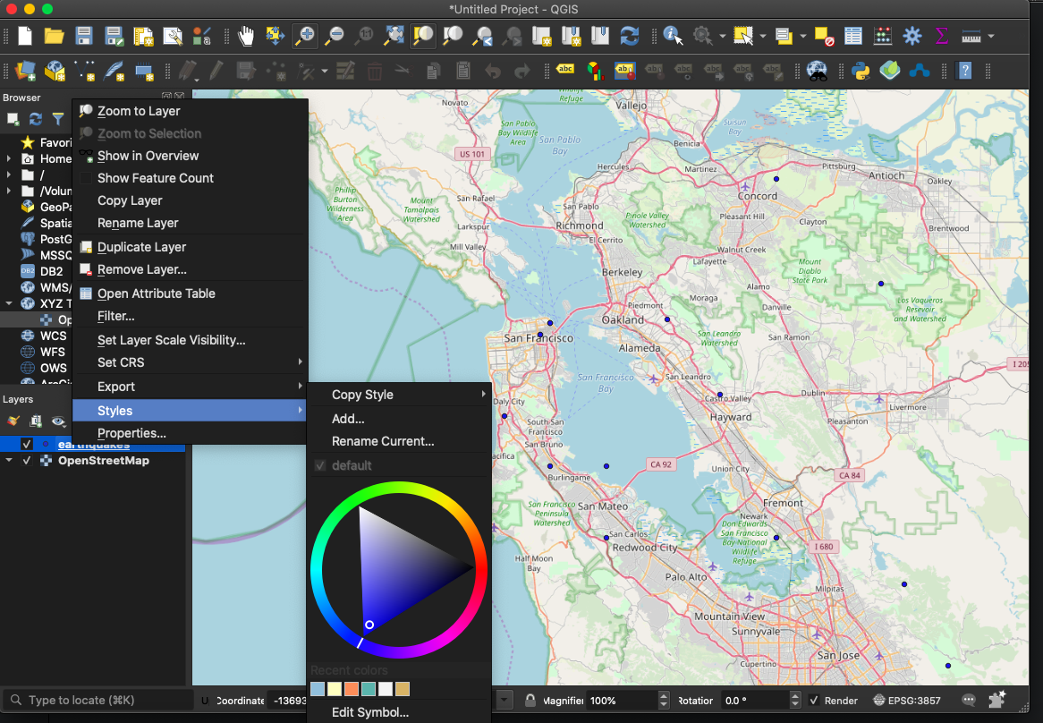
Next, right click on the “earthquakes” layer in the “Layers” menu. In the pop up menu, click on “Styles” and use the resulting color wheel to choose a new color for the points on the map marking where the earthquakes occurred. Try to make it one that is brighter or more noticeable than the original color of the symbols.
Switch back to the “Print Layout” menu, and again select “Add Item” and then “Add Map.”
This time, use the cursor to drag a smaller square on top of the preexisting map of California, perhaps in a corner or off to the side where it won’t cover any data points.
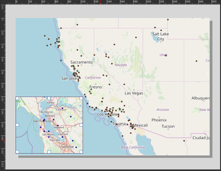
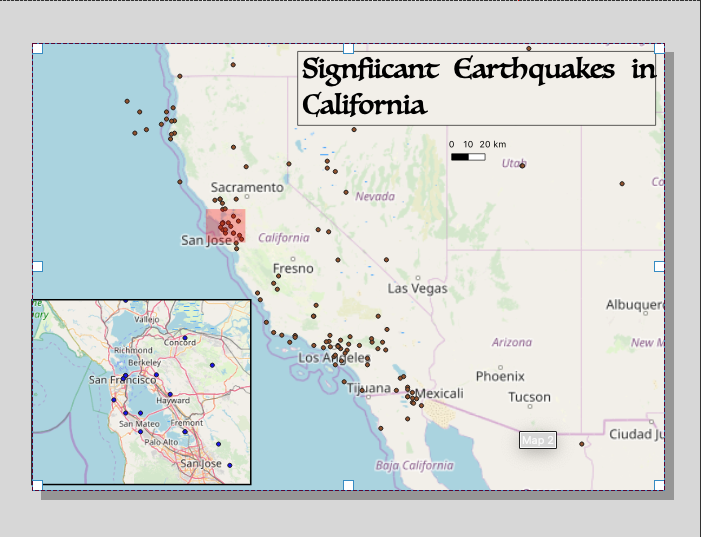
Now, we want to make the inset look better with a frame and highlight the area from which the inset was taken.
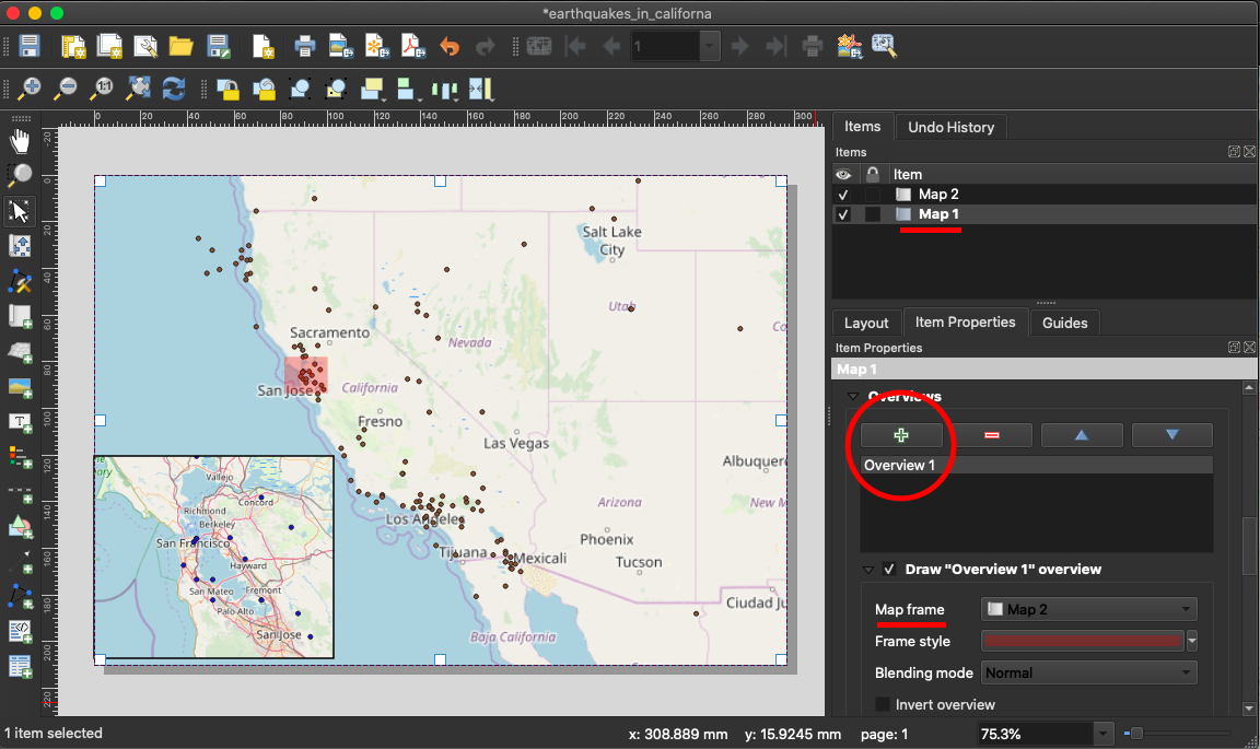
In the “Items” menu on the right-hand side of the page, select “Map 2,” which is the inset map. Click on the “Item Properties” tab, and then make sure that the button next to “Frame is checked.” A menu should then appear, and you should change the thickness to 1.0 and hit “Enter” on your keyboard. A border should appear around the inset.

Now, select “Map 1”, the larger map, from the “Item” list. Select the “Item Properties” tab, and then scroll down to the “Overviews” section. Click on the green plus sign to add an overview; once you have done that, select “Map 2” as the Map frame. This indicates that Map 1, the larger map, should be highlighted with the selection from Map 2, the inset map.
Next, we’ll add a label to the top of the map. Go to “Add Item” at the top ribbon, and then hover over “Add Shape,” and then click on “Add Rectangle.” Then use your cursor to drag out a rectangle on top of the map, preferably away from the inset and the majority of the data points.
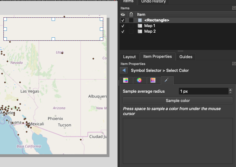
To color the rectangle, make sure that it is selected in the “Item” list, then go to “Style”; to change the color to match the map underneath it, then go to “Symbol Selector,” then “Select Color,” and then choose the tab to sample a color. You can then use a dropper to select a color from the background map for the background of your label.
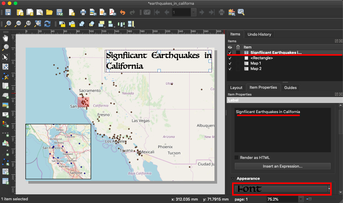
Next, to actually add a label to the map, go to “Add Item” and then “Add Label.” You can then change the font and label as you should so choose, using the Appearance menu on the right-hand side of the page.
Finally, for the last touch that we’ll be putting on this map, go to “Add Item,” and then go to “Add Scale Bar.”
A menu such as the one pictured in the image below should appear.
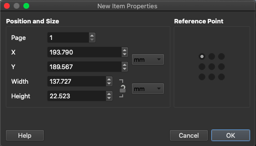
These options give you the ability to control the size of the scale bar. Click “OK,” and you will have a scale bar on your map.
Once you save your layout, you can then export it to an image file, an SVG, or even a PDF.
Congratulations! You’ve made a map with QGIS. You are ready to continue on to our series of exercises which will introduce you to more applications of XQuery to XML-based projects in digital humanities.
Here is our series of exercises on newtFire designed to build on this introductory tutorial:
For more on QGIS, feel free to consult the QGIS Tutorials and Tips website, which will teach you how to do pretty much anything with this software.