 Last modified:
Wednesday, 06-May-2020 17:54:38 UTC. Authored by: Fiona Carter (frabbitry at gmail.com) Edited and maintained by: Elisa E. Beshero-Bondar
(ebbondar at gmail.com). Powered by firebellies. Last modified:
Wednesday, 06-May-2020 17:54:38 UTC. Authored by: Fiona Carter (frabbitry at gmail.com) Edited and maintained by: Elisa E. Beshero-Bondar
(ebbondar at gmail.com). Powered by firebellies.
Last modified:
Wednesday, 06-May-2020 17:54:38 UTC. Authored by: Fiona Carter (frabbitry at gmail.com) Edited and maintained by: Elisa E. Beshero-Bondar
(ebbondar at gmail.com). Powered by firebellies. Last modified:
Wednesday, 06-May-2020 17:54:38 UTC. Authored by: Fiona Carter (frabbitry at gmail.com) Edited and maintained by: Elisa E. Beshero-Bondar
(ebbondar at gmail.com). Powered by firebellies.For this assignment, you’ll work with data from the Digital Archives and Pacific Cultures Project and the Ferdinand Magellan Project to create a map that examines how historical navigators travelled around weather conditions and how similar two historic voyages were to each other.
The Digital Archives and Pacific Cultures Project examined the travel logs from historical navigators and encoded those logs in TEI XML. For this assignment, we’ll be looking at the voyages of Captain Cook and Georg Forster, both of whom travelled the Pacific in the 1700s.
The Ferdinand Magellan Project examines the voyage of Spanish explorer Ferdinand Magellan, who set sail in 1519 to discover a Western sea route to the Spice Islands and became the first European to cross the Pacific Ocean in the process. This project encoded Magellan’s logs for this ground-breaking voyage.
All of these seafarers were affected by the weather patterns in the ocean they travelled, and so, with this assignment, you’ll look at where the points the voyagers described in their logs stack up next to global oceanic weather patterns, sea surface temperature and wind speed. Furthermore, you’ll look how the points described in logs by the later voyagers Cook and Forster compare to points described in logs by Magellan and see how spatially similar the voyages were to each other with nearest-neighbor analysis.
Could weather have impacted the routes of Cook, Forster, or Magellan, and would that result in them have described similar locations in their logs?
Projects looking at historical subjects often have the added challenge of needing to work with historical data, which can sometimes be messy. Furthermore, sometimes data is missing or incomplete. As such, sometimes it can be challenging to merely find relevant historical data, let alone relevant historical geodata.
Note: A good starting point for finding historical geodata is The American Association of Geographers’ Historical GIS Clearinghouse and Forum.
First, download the Network Common Data Form (NetCDF) file of global sea surface temperatures from 1850-2020, created by the Hadley Centre in conjunction with the Climatic Research Unit of the University of East Anglia.
Sea surface temperature file: absolute.nc
Save it to your local machine in a place that you will remember.
This file is a raster file, which means that it’s made up of matrices of discrete cells that represent features on, above, or below the earth’s surface. These cells are rectangular and uniform.
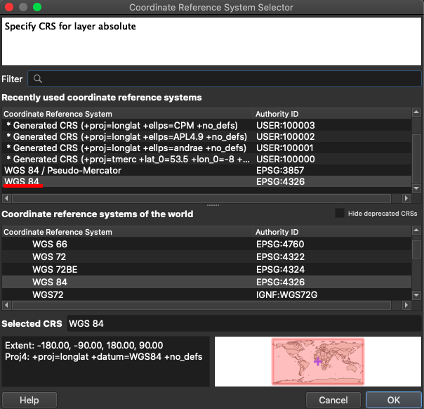
To import the .nc file into QGIS, go to Layers > Add Layer > Add Raster Layer. Once there, click on the three dots next to “Raster Database(s)” to navigate to your file. Then, click “Add.”
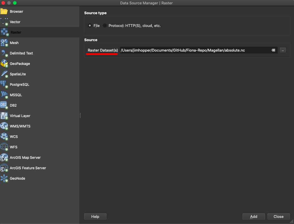
Next, a window asking for you to choose a CRS (coordinate reference system) may appear. If prompted, be sure to select WGS 84, then click OK.
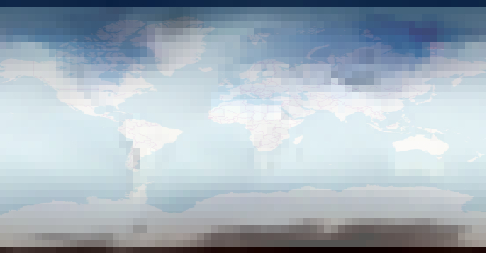
A layer called “absolute” should appear in the project, and it should look like the following image.

As you can see, this layer looks pixelated because it is made up of many cells, rectangles, of data. The darker blue and black areas are where the ocean is colder, while the lighter areas, closer to the equator, represent warmer ocean surface temperatures.
Since this is a raster layer of the ocean, it’s kind of hard to see where the continents are. Next, add the OpenStreetMap XYZ Tile layer, as you did in the Intro Tutorial. Make sure that it is above the “absolute” layer in the Layers menu; the “absolute” layer should disappear from view.
We’re going to alter the transparency of the “OpenStreetMap” layer so that we can see the “absolute” layer through it. After all, we don’t want to completely erase the sea surface temperature data; we just want to be able to more easily contextualize the information presented there.
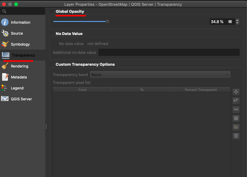
Right click on the “OpenStreetMap” layer in the “Layers” menu and select “Properties…” from the resulting menu. On the menu on the left-hand side, select “Transparency.”
In the “Transparency” tab, we want to lessen the Global Opacity so that the layer becomes more transparent and we can see the “absolute” layer through the “OpenStreetMap” layer. You can click and drag the sliding bar underneath “Global Opacity” or type in an opacity into the text box beside the sliding bar to alter the opacity. I found that an opacity around 35% worked well, but you should test out some different opacities to find one that works. Click “Ok” when finished to return to the map.
It should now look like the following image.
Now, the continents are now more visible on the map, and we can more easily contextualize the ocean surface temperature information.
Now, we’ll work with wind speed data from the Global Forecast System (GFS) of the US National Weather Service.
Download the following .csv file and save it to your machine. It was acquired from the ERDDAP server hosted by the Pacific Islands Ocean Observing System.
The data in this file has already been cleaned and corrected; however, as it is, it is incomplete.
You should open the file in a spreadsheet editing program, such as Microsoft Excel or LibreOffice. Notice that there are five columns: id, latitude, longitude, u component, and v component. As you're opening the document, you may be asked to specify the comma as the delimiter in the document. You should enter through this to open a CSV in an Excel environment.
The id column is a unique identifier for each row. We’ll use that later. The latitude and longitude columns are pretty self-explanatory, because they hold the geocoordinates for the wind vectors. The u component and the v component columns hold the u-component and v-component of the wind vectors, respectively.
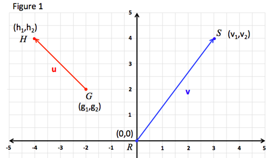
A vector is a direction with magnitude. It’s, graphically, an arrow pointing in a certain direction with a certain size, or length. Because we often want to graph vectors on the Cartesian plane, we talk of vectors as having x-components, also sometimes called i-components, and y-components, or j-components. A vector’s x-component is the number of units it stretches horizontally, and a vector’s y-component is the number of units it stretches vertically.
So if you look at the following image, you can identify the red and blue lines as vectors, and you can see that the red one has been named u and the blue one v. They have different directions and different sizes, magnitude. Consider vector v. It starts at point R, (0,0), and ends at point S, (3,4). The x-component of vector v would be 3, because it stretches out 3 units in the x-direction. The y-component would be 4, because it stretches up 4 units in the y-direction. Vector u, alternatively, moves two units to the left and two units up. As such, it has an x-component of -2 (because it’s moving along the negative x-axis, or to the left) and a y-component of 2.
 Source:Component Form and Magnitude
If you imagine a right triangle like the one below, the y-component would be like the vertical, up-and-down leg of the triangle, while the x-component would be like the horizontal, right-and-left leg of the triangle.
 Source:Right
triangle - Simple English Wikipedia, the free encyclopedia
Source:Right
triangle - Simple English Wikipedia, the free encyclopedia
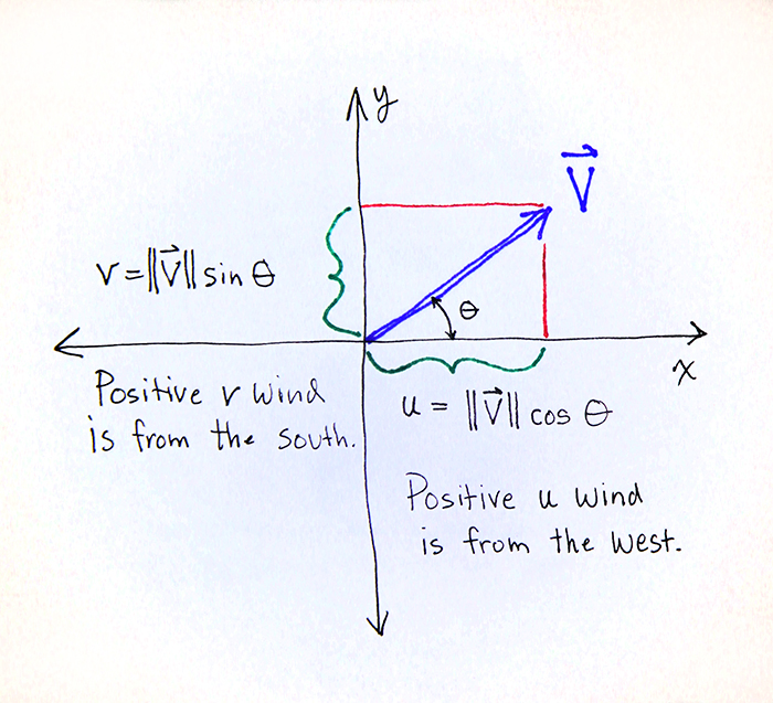
For some reason, meteorologists decided to call the x-component of a vector its u-component and the y-component its v-component. With wind vectors, you say that a vector moving to the right has a positive u wind from the west, and a vector moving up has a positive v wind from the south. If a vector was moving down and to the left, you’d say that it has a negative u wind from the east and negative v wind from the north. You can kind of see that in the image below, which describes a vector with u and v-components. Just ignore the circle with a line through it and the equations for u and v, for now.
 Source: http://colaweb.gmu.edu/dev/clim301/lectures/wind/wind-uv
In short, the columns “u component” and “v component” hold the u and v components of each of the wind vectors, or how much they move in the x- and y- directions, respectively.
Hopefully you haven’t been scared off, yet.
So we’ve got the u- and v-components of the vectors, now we’ve got to get the vectors themselves. If you remember the right triangle from above, we’ve got the horizontal and vertical legs of the triangle, and now we want to get the diagonal leg, the hypotenuse, that connects the horizontal and vertical legs.
What’s a vector, again? It’s a direction with magnitude. As such, we need to use the u- and v-components to find the direction of the vector and its magnitude.
The direction of the vector is its angle up or down from straight zero degrees. We usually name that angle “theta,” which is designated with \theta. It’s the circle with a line through it. It will always be less than 180 degrees, because it’s part of a triangle.
Okay, now go way back to trigonometry.
 Source: Right Triangle Definitions for Trigonometry Functions -
dummies
Source: Right Triangle Definitions for Trigonometry Functions -
dummies
I’m not going to hold forth on this because this isn’t a math class, but maybe you’ll remember that to find the theta, as pictured in the image above, you’ll need to take the inverse of the tangent function, or the cotangent. The adjacent leg is the x- or u-component and the opposite leg is the y- or v-component.
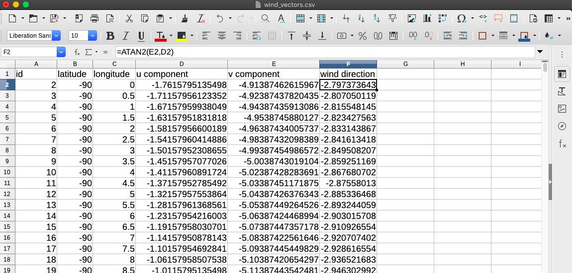
So what do we need to do? Take the u-component and divide it by the v-component. Or let the spreadsheet editor do it for us with a formula. This will give us the value of the angle, or the direction of the wind vector.
Your spreadsheet editor should have a function called Atan2(), which takes in 2 arguments: the u-component and the y-component of the vector.
Atan2(v-component, u-component) = \theta
To utilize a function in a spreadsheet editor, go to a blank column, type in “=“ and then your function, referencing the names of the cells (column letter and row number) that you want to use for the calculation.
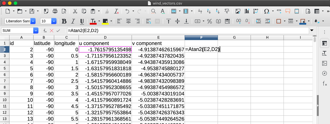
Hit “Enter” and you should see a number in place of the formula.
Congratulations! You’ve just calculated 1/1048576 of the wind directions!
DO NOT waste countless hours typing that 1048575 more times.
Copy the cell that you just calculated (by right clicking it, or selecting it and hitting CTRL+C, etc.) and paste it into the top row, the row with the column labels. When you do that, you SHOULD get #Value as the result--because it's trying to use words - the labels - to do a mathematical calculation. Just ignore it for now.
Highlight the entire column by clicking on the column letter. Then, hit CTRL+D (or Command+D). (If those delete, use CTRL+V or Command+V instead.) The rest of the column values should populate with the calculations. You can then erase #Value and rename the column something sensible, like "wind direction."
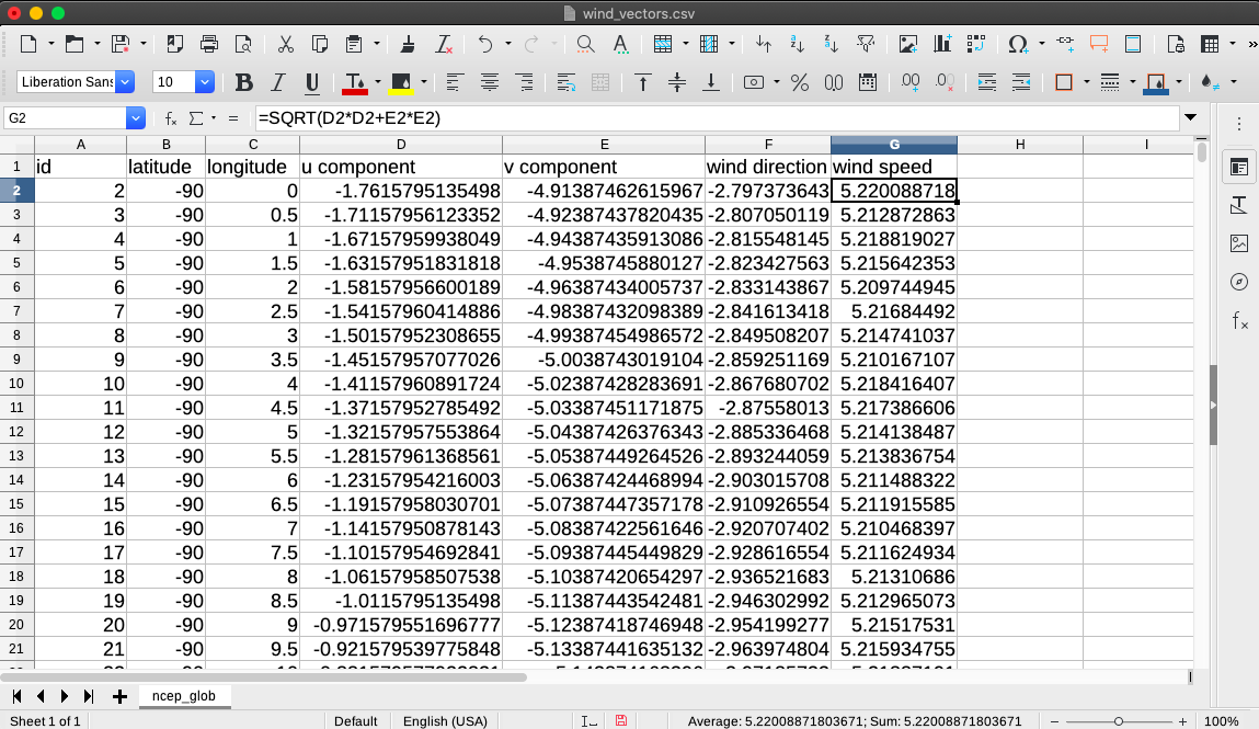
Now, we need to get the vectors’ magnitudes. In other words, we need to find the hypotenuse of the triangle.
If you go WAY back, you may recall something called Pythagorean’s Theorem.
a^2+b^2=c^2, with “a” and “b” the opposite and adjacent legs of the right
triangle and “c” the hypotenuse.
Or,
c = √a^2 + b^2
In words: the hypotenuse is equal to the square root of the value of one leg multiplied with itself added to the value of the other leg multiplied with itself.
As such, we can use another spreadsheet formula, SQRT(), to do the calculation for us. = SQRT( u-component * u-component + v-component * v-component).
So go to the next blank column, type “=“, and then type the function, referencing the cell names like you did with Atan2().

Hit “Enter” and a number should fill the cell. To populate the rest of the rows in the column, repeat the process that you just did for the wind direction column. Name the column something like “wind speed”.
You should end up with something like the following image.
Save the file. Congratulations! You’ve prepped the data.
Import the .csv file that you just saved to QGIS as a delimited-text layer. Yes, you should then see that it completely takes over your QGIS screen.

That’s because, right now, it’s styling each of those vectors as single points, not vectors.
Right click on the wind vector layer and click on “Properties…” Then go to the “Symbology” tab.
Click on “Single Symbol” at the top of the window and select “Graduated” from the resulting menu.
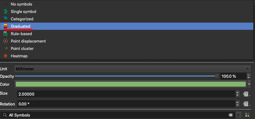
Now, select “wind speed” (or whatever you named the wind speed column) as the “Column” (or “Value”) by clicking the drop-down menu arrow button on the right-hand side of the window and selecting the “wind speed” field from the resulting list.
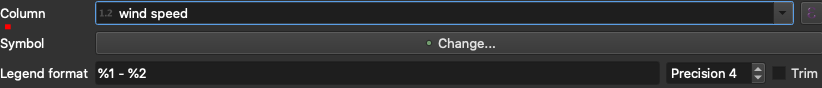
Next, click “Change…” next to “Symbol”. The Symbol Selector window should appear. Scroll down to the bottom of the symbol menu and select the “triangle red” symbol. Make sure that this is a "Font Marker," you may need to click on "Simple Marker" and then select "Font Marker" from the dropdown menu next to "Symbol Type." Then, click on the square on the far right-hand side of the window opposite “Rotation”, hover over “Field Type: int, double, string” and select “wind direction” (or whatever you named the wind direction column) from the resulting menu. This means that the directions of the symbols will be altered by this column.
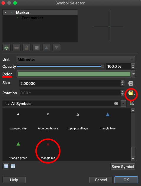
Click Ok. Back in the Sybmology tab, you can then click on “Color ramp” to change the colors of the color ramp. I changed mine so that the first color of the ramp, the starting point, was a teal blue and the second color of the ramp, which will represent the larger values, was an orange.
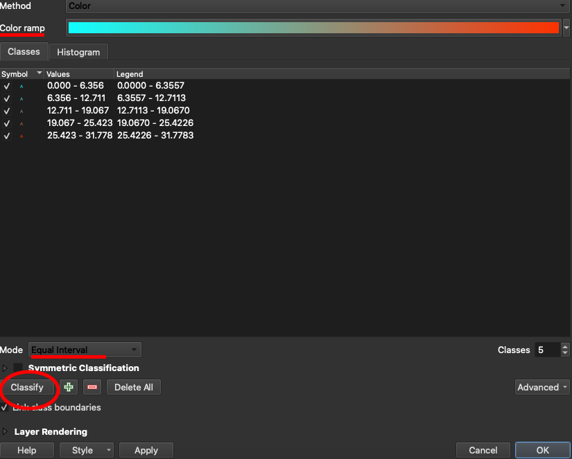
Then, make sure that the “Mode” is “Equal Interval.” Then click on the “Classify” button. You should see several symbols of different colors - according to the color ramp you chose - pop up in the menu, along with value ranges.
NOTE: Your symbols may not immediately change color according to the color map when you classify. IF THIS HAPPENS go back and change the symbol from a "Font Marker" to "Vector Field Marker;" you should then see that the symbols have changed color according to the color ramp, and so then you should go back and change the marker type back to "Font Marker." The symbols should remain having changed according to the color ramp.
Click on OK when finished. The resulting map should look something like this, of course depending on the color ramp that you chose.
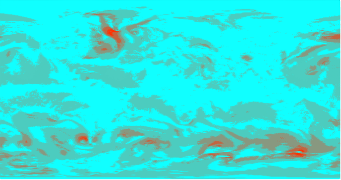
This is a map of the various wind speeds around the globe, with, in my image, the orange color representing areas with high wind speeds and light blue areas representing areas with low wind speeds.
However, we’ve lost our sea surface temperature data and the OpenStreetMap layer! Go back to the Properties of the wind vector layer and return to the Symbology tab.
At the bottom of the window unhide the “Layer Rendering” section, then use the sliding bar next to “Opacity” to alter the transparency of the layer. I found that an opacity around 20% works in order to see the sea surface temperature information through the wind vector layer.
The resulting map should look something like the following image.
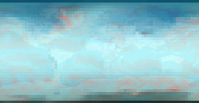
Now you can see the areas of high wind speed, orange on my map, along with areas of warm sea surface temperature, light blue, along with the outlines of some continents for context. The areas of high wind speed and high sea surface temperature are areas where storms are more likely to occur.
Congratulations! You’ve finished the base map.
Download and save the following three files, which were grabbed via XQuery from Magellan and Pacific Project data.
Import “magellan.csv” as a delimited-text layer into QGIS, just as you’ve done before. The second column will be the X coordinate and the third will be the Y coordinate.
Import “pacific.csv” as a delimited-text layer into QGIS as well, being sure to check the box next to “DMS Coordinates.” The latitude and longitude coordinates in “Degree Minute Second”, or DMS, format. Checking the box allows QGIS to account for that. The third column will be the X coordinate and the second will be the Y coordinate.
Finally, import “magellan_desc.csv” into QGIS as a delimited-text layer. This file, if you open it, has no latitude or longitude coordinates. It contains merely a column containing a unique identifier for each row and then place names (sometimes those are written as latitude or longitude coordinates, but we’re counting them as names, here, because that’s what they were encoded as in the original project data.) Because of this, be sure to select “No geometry (attribute only table)” in the “Geometry Definition” section.
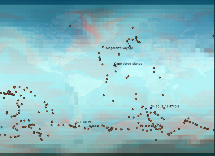
The map should now look something like the following. On my map, the pink dots are the Pacific Project data points, and the blue points are the Magellan data points. There is no apparent “magellan_desc” layer visible on the map because that layer does not contain geocoordinates of any sort.
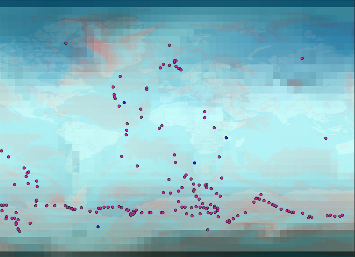
What the “magellan_desc” layer DOES contain are labels for each of the Magellan data points. However, before we can label the Magellan points with the labels contained in the “magellan_desc” layer, we need to join the “magellan_desc” layer to the “magellan” layer.
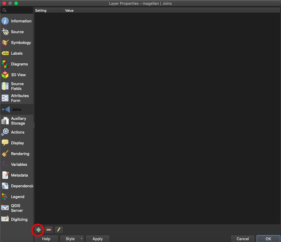
Right click on the “magellan” layer and click on “Properties…” Go to the “Labels” tab and click on the menu that currently has “No Labels” selected. Then, select “Single Label” from the resulting menu. If you click on the drop-down menu next to “Label with,” you’ll see that the only options are fields 1, 2, or 3, none of which contain meaningful labels for the Magellan data points. Field 1 contains IDs, field 2 contains latitude points, and field 3 contains longitude points. The names of the data points are contained in the “magellan_desc” layer, so we need to join the two layers together.
Go to the “Joins” tab and click on the green plus sign on the bottom left-hand side of the window.
What does it mean to join two layers together? It means that you find a common value that connects each row of one layer to each row of the other. In this case, the IDs for the latitude and longitude points in the “magellan.csv” file are the same as the IDs for the place names in the “magellan_desc.csv” file. As such, we’ll use the ID column in both of the tables, layers, to join them together.
Essentially, we’re saying that that the data contained in the columns of the “magellan_desc.csv” file is connected to the data contained in the columns of the “magellan.csv” file because they share the same ID.
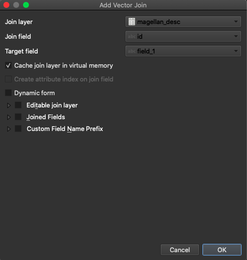
In the “Add Vector Join” window, select “magellan_desc” as the “Join Layer”. The “Join Field” should be “id” - the name of the column of IDs in the “magellan_desc.csv” file. The “Target Field” should be “field_1”, the column of IDs in the “magellan.csv” file. Then click “Ok.”
If you go back to the “Labels” tab, you should notice that “magellan_desc_name” becomes an option in the dropdown menu for “Label with”. The join was successful! Select that, then you can style the font and the colors of the labels using the options below. Click “Ok” when done.
The map should now look like the following image.
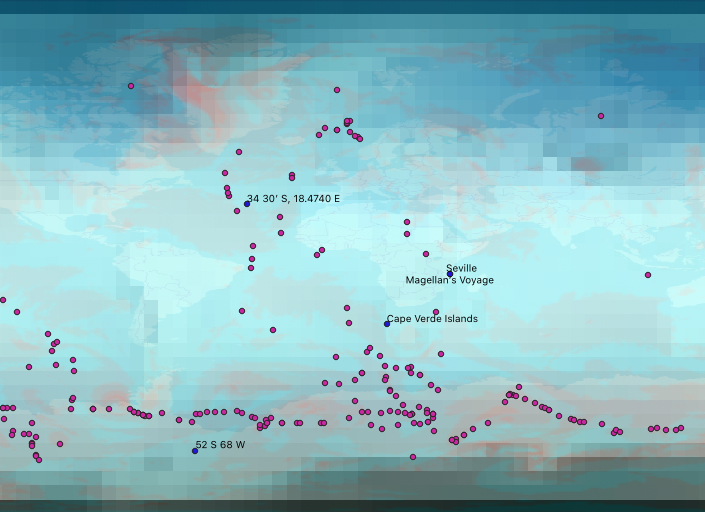
There are now labels for each of the Magellan points!
It may not be immediately apparent, but there is incomplete data in the “pacific.csv” file. Some rows contain only a latitude or a longitude point. These points can’t actually be mapped because they are incomplete, and they will be harmful for the analysis that we want to do later. They’re called “null geometries,” and we need to remove them.
In the top ribbon, click on “Processing,” then click on “Toolbox.” A menu should appear on the right-hand side of the window. Expand “Vector Geometry” and then double-click on “Remove null geometries.”
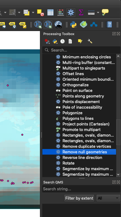
The “Remove Null Geometries” window should appear. Select “pacific” as the “Input layer,” and then click “Run.” The “Log” should then appear, and the progress of the process will be indicated by the status bar at the bottom of the window. When the process is finished, you can close the window.
Though the difference won’t be apparent strictly by looking at the map, you should now see a layer called “Non null geometries” in the layer menu. You can remove the check from the box next to the “pacific” layer to hide it, now. This new layer is exactly the same as the “pacific” layer, only without any of the null geometries.
This layer will be what we will use for our upcoming analysis.
The last part of this assignment is to use nearest-neighbor analysis to construct a visualization of how close the Magellan points were to some of the Forster/Cook points. To do this, we’ll first construct a distance matrix.
A distance matrix will take points on the map and then calculate the distance between them. Actually, it will be calculating the magnitude of the vector between the two points - a calculation you know how to do - but that is perhaps beside the point.
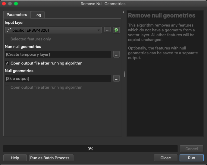
Unhide the “Vector analysis” section of the “Processing Toolbox,” then scroll down and double-click “Distance Matrix.”
In the Distance Matrix window, select “magellan” as the “Input point layer,” “field_1” as the “Input unique ID field,” “pacific” as the “Target point layer,” and “field_1” as the “Target unique ID field.” Then, ensure that the output matrix type is a Linear (N*k x 3) distance matrix, and that 1 is in the box beneath “Use only the nearest (k) target points,” which means that only the nearest neighbor will be produced in the output. Click “Run,” when finished, and then wait for the process to finish before closing the window.
That created a new layer called “Distance matrix,” and it should be now represented by points on the map. If you were to open the attribute table of this new layer, you’d notice that there’s columns for the input layer’s ID, the target layer’s ID, and the distance between those two points.
Now, we want to change the styling of the “Distance matrix” layer so that it’s a little bit more intuitive that it’s representing a distance. Right click on the layer and click on “Properties…”
Go to the Symbology tab. Click on “Simple marker,” beneath “Marker.” Then, click on the “Symbol layer type” menu and select “Geometry generator.”

Then, change the “Geometry type” to “Line/Multiline String.”
In the expression window, type make_line(point_n( $geometry, 1), point_n(
$geometry, 2))
This basically says to draw a line between points. In our case, lines will be drawn between the Magellan points and the Pacific points that are nearest to those points.

Click Ok.
The resulting map should look something like the following image, though mine is zoomed in on South America and Africa.
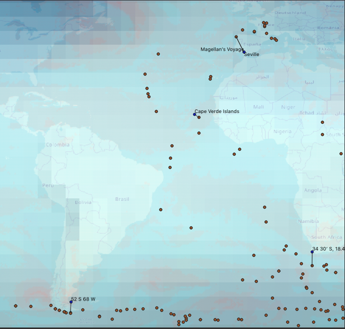
You can see that there are now lines connecting the Magellan points to the Pacific points nearest to them.
You can see that the Magellan points are closest to Pacific Project points most often in areas of high wind speed and high surface water temperature - areas where storms are likely to occur.
Of course, more data, especially more Magellan data, would make this graph more interesting. However, I think it is apparent that weather may possibly have affected the Cook and Forster voyages, because you can see that those points are clustered in areas of high wind speed and low sea surface temperature.
Use Map Layout to create a nice picture of your map, complete with features like a title or legend that make your map more easily understood by others. NOTE: We found that if we exported the map to SVG this time the file size was enormous, and it was better to export an image and choose .PNG as the file type for a more portable graphic.
When you’re finished, upload the following files to Canvas:
Here is the complete series of QGIS exercises on newtFire:
For more on QGIS, feel free to consult the QGIS Tutorials and Tips website, which will teach you how to do pretty much anything with this software.